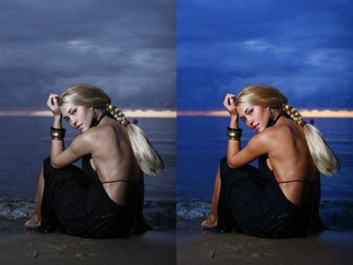
At Yulixislido, we constantly strive for exceptional. Our "Visual Harmony: Light, Tone & Detail Refinement" project began with a clear goal: to elevate our digital platforms beyond mere functionality. We observed subtle inconsistencies in how light, tone, and detail were rendered, impacting the overall user experience. Our aim was to forge a unified visual language, ensuring every pixel contributed to an effortlessly intuitive and deeply satisfying interaction. This wasn't just about aesthetics; it was about embedding Yulixislido's core values—precision and user-centricity—into the visual fabric of our services. We wanted users to feel genuine clarity and delight, recognizing the meticulous care in every touchpoint.
A significant hurdle was achieving consistent visual depth across our diverse, dynamically generated content. Our platforms feature numerous modules, each with subtle interpretations of shadows and highlights. The turning point came when we realized a simple style guide wouldn't suffice. We needed a fundamental, universal methodology for rendering light and tone programmatically. This involved extensive experimentation with CSS, careful calibration of color values, and a deep dive into visual perception. Overcoming this required technical prowess and a collective commitment to pixel-perfect precision, ensuring every element appeared part of a cohesive, elegant whole.
The culmination is a sophisticated, integrated visual design system, profoundly redefining the aesthetic quality of Yulixislido's digital presence. We crafted comprehensive guidelines for color, typography, iconography, and a meticulously refined approach to light, tone, and detail across all interfaces. This system is a living library of reusable components, empowering faster, more consistent development.
The impact on our service and client experience has been immediate and overwhelmingly positive. Our applications now exude a polish and consistency users have warmly embraced, reporting enhanced usability and satisfaction. Navigating our platforms feels more intuitive, less fatiguing, and genuinely enjoyable. Technically, this project has been transformative. It streamlined front-end development, reducing design-to-development friction and ensuring new features align with our refined visual standards. It also fostered a deeper understanding of scalable design principles within our engineering teams.
This project was a journey of collective growth and discovery. We learned invaluable lessons about the profound impact of minor details on overall user perception. It underscored the critical importance of a robust design system for scalable and consistent digital products. It reinforced our belief in interdisciplinary collaboration, demonstrating that true innovation flourishes when diverse talents converge. This experience deeply influenced our development processes, embedding a more rigorous visual audit into QA and encouraging a proactive, design-first approach. Professionally, every team member emerged with heightened appreciation for visual theory, advanced technical implementation, and an even stronger commitment to crafting experiences that are not just functional, but truly beautiful and harmonious. We now approach every challenge with an even keener eye for perceptual excellence.